Case Study
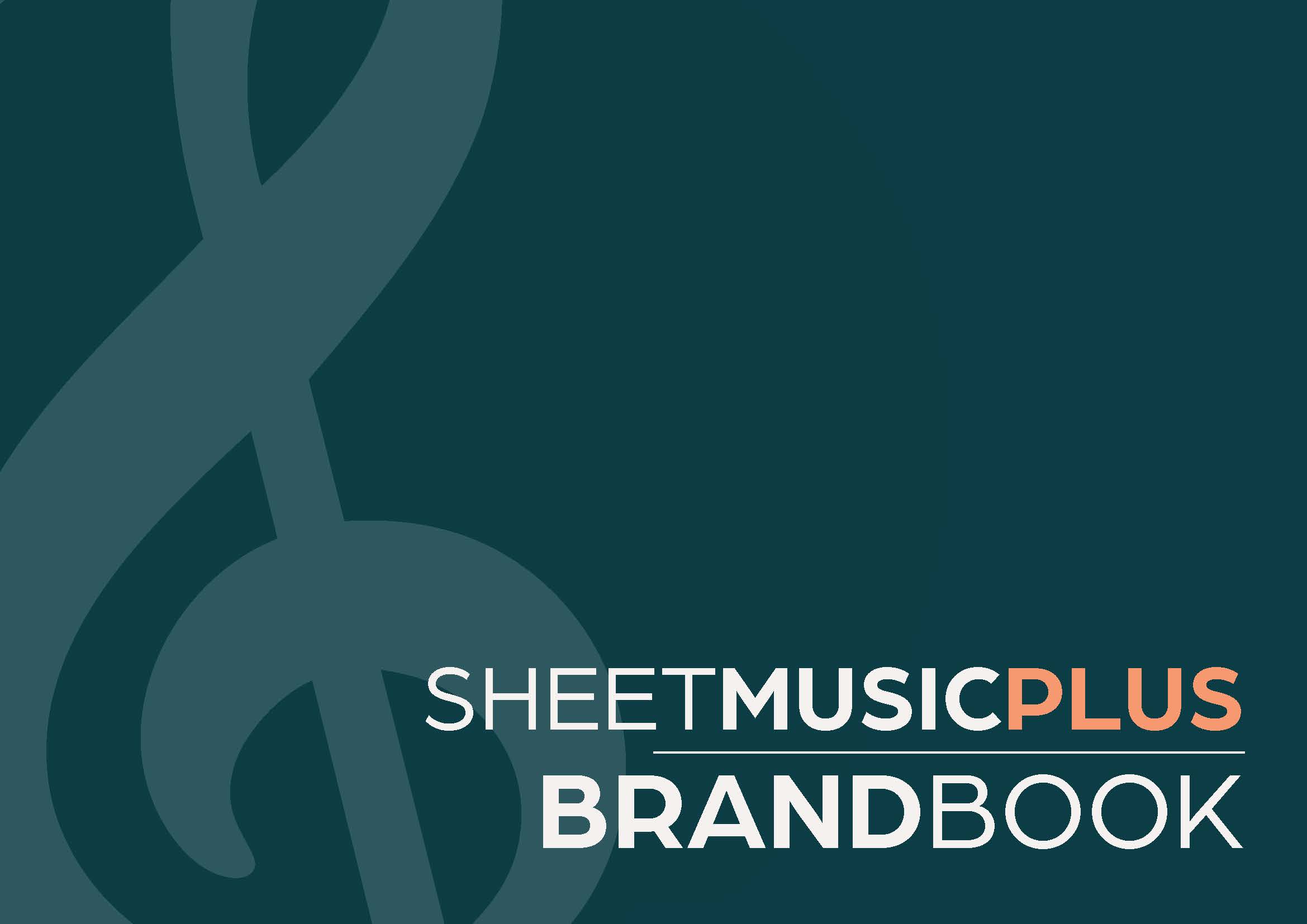
Sheet Music Plus // Logo & Brand Identity
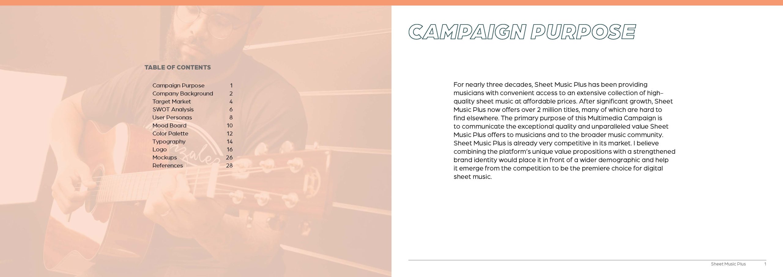
For nearly three decades, Sheet Music Plus has been providing musicians with convenient access to an extensive collection of high-quality sheet music at affordable prices. After significant growth, Sheet Music Plus now offers over 2 million titles, many of which are hard to find elsewhere. The primary purpose of this Multimedia Campaign is to communicate the exceptional quality and unparalleled value Sheet Music Plus offers to musicians and to the broader music community. Sheet Music Plus is already very competitive in its market. I believe combining the platform’s unique value propositions with a strengthened brand identity would place it in front of a wider demographic and help it emerge from the competition to be the premiere choice for digital sheet music.

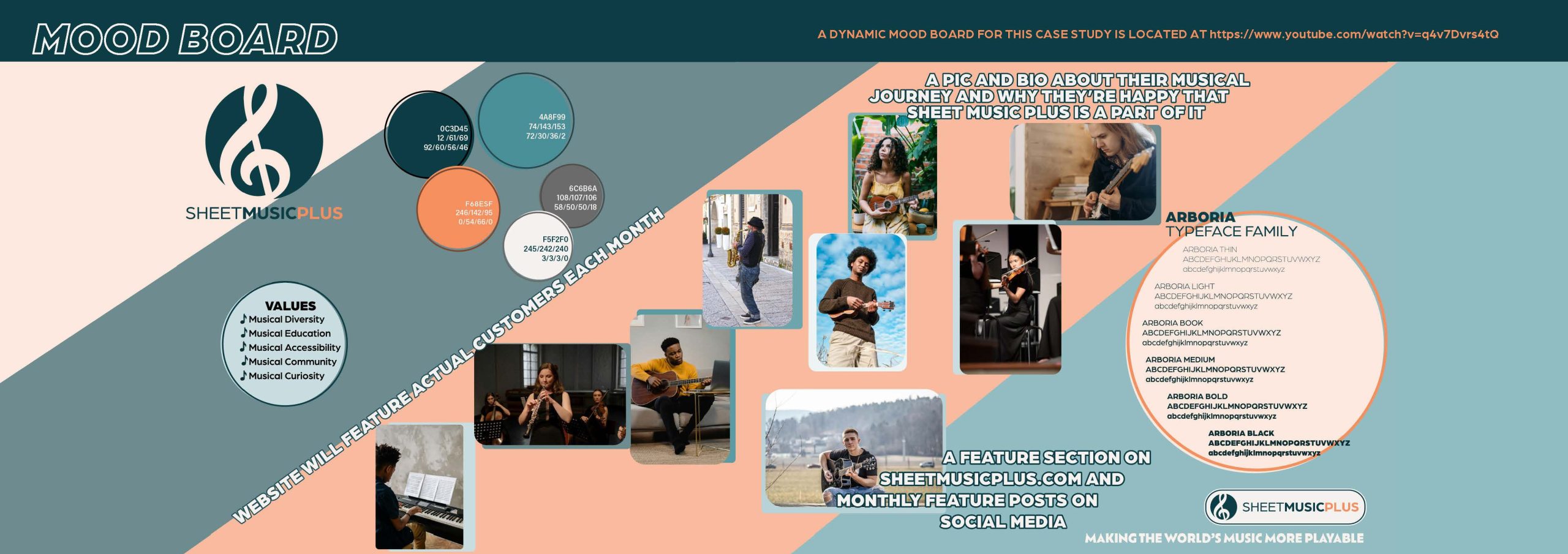
Sheet Music Plus | Dynamic Mood Board
The Design

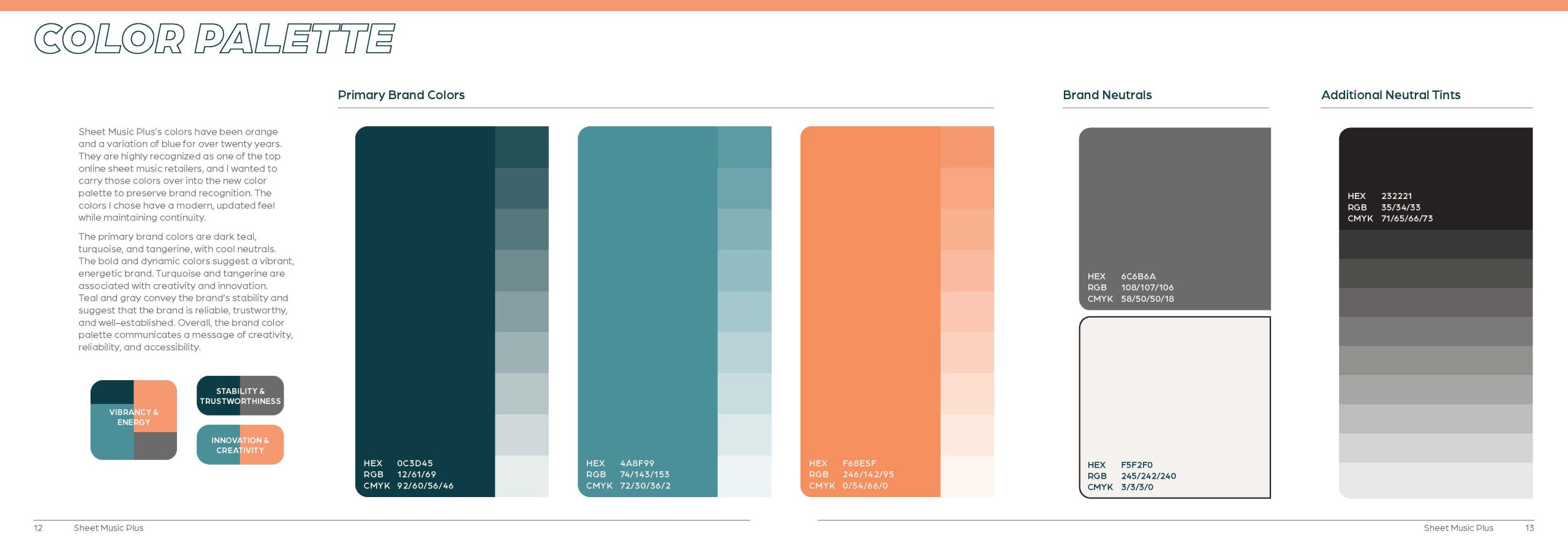
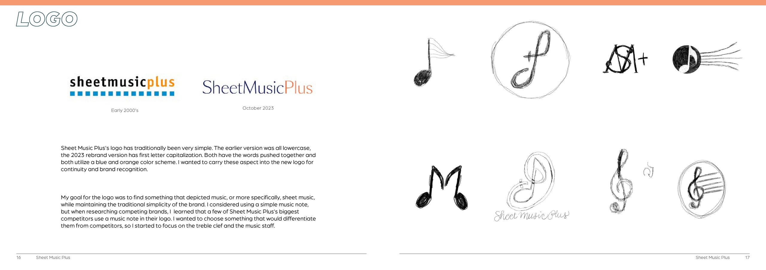
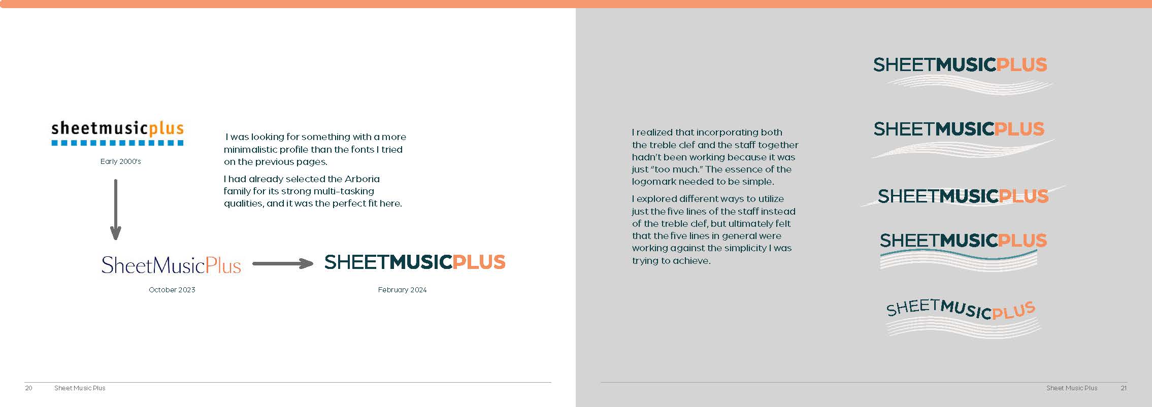
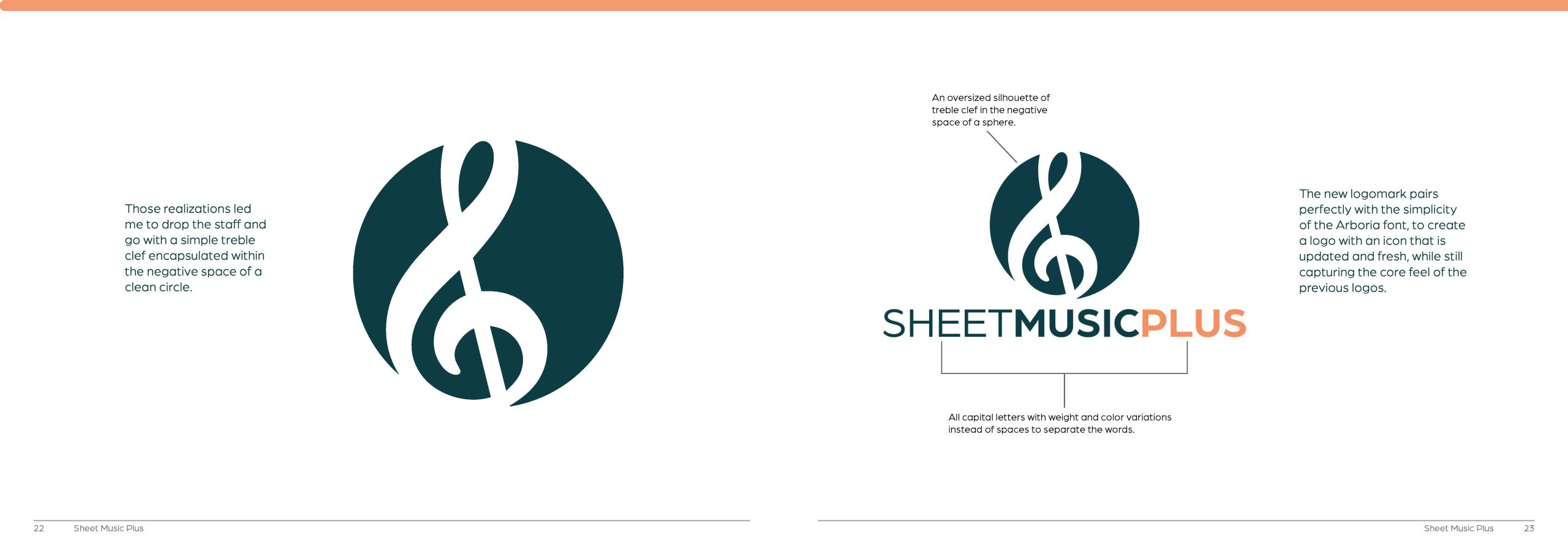
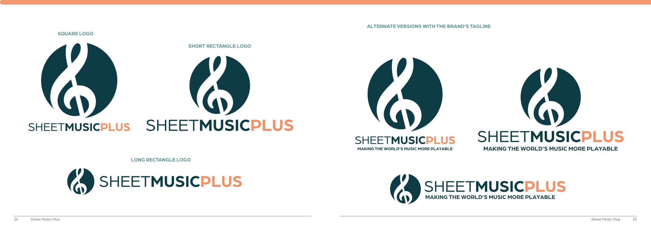
Sheet Music Plus’s logo has always been simple, with all three words pushed together with no spaces, and uses a blue and orange color scheme.
I wanted to carry these two aspects into the new logo for coninutity and brand recognition.
Color Palette

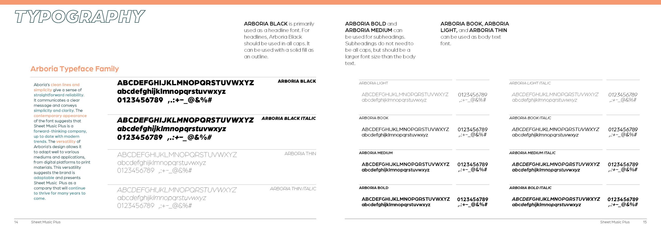
Typography

Brand Pattern
This seamless brand pattern is made of hand-drawn instruments and can be added as a fun element to packaging and designs.

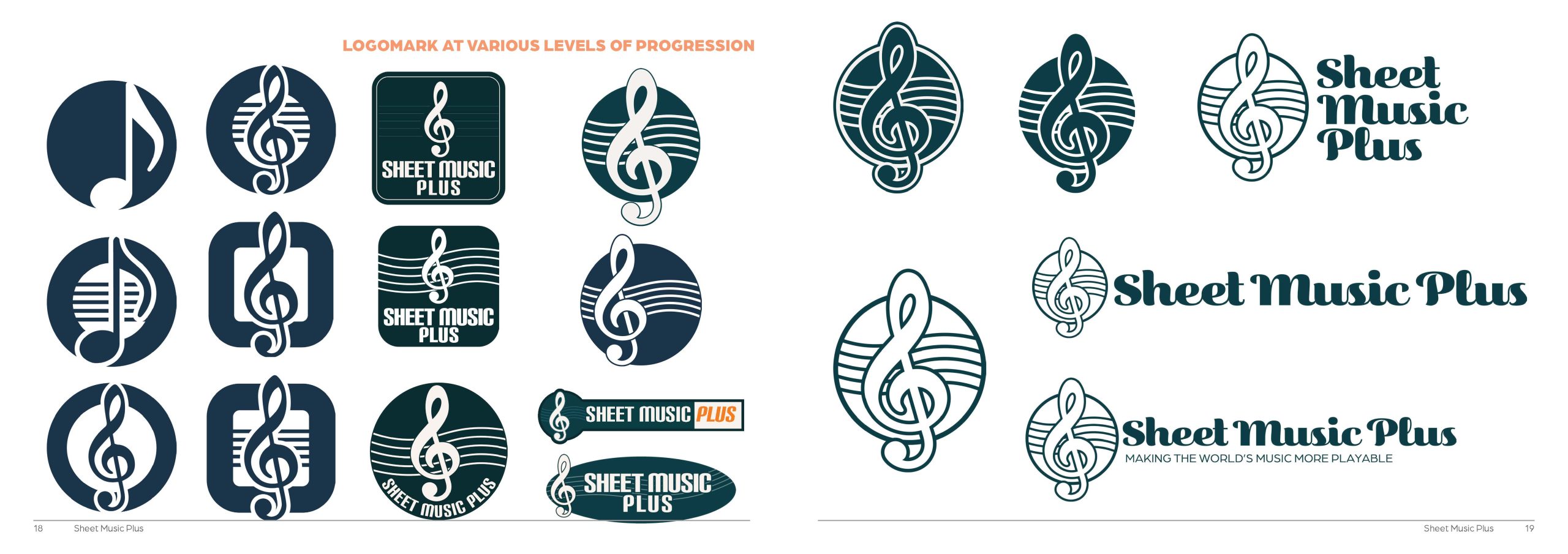
Logo Development


Final Design


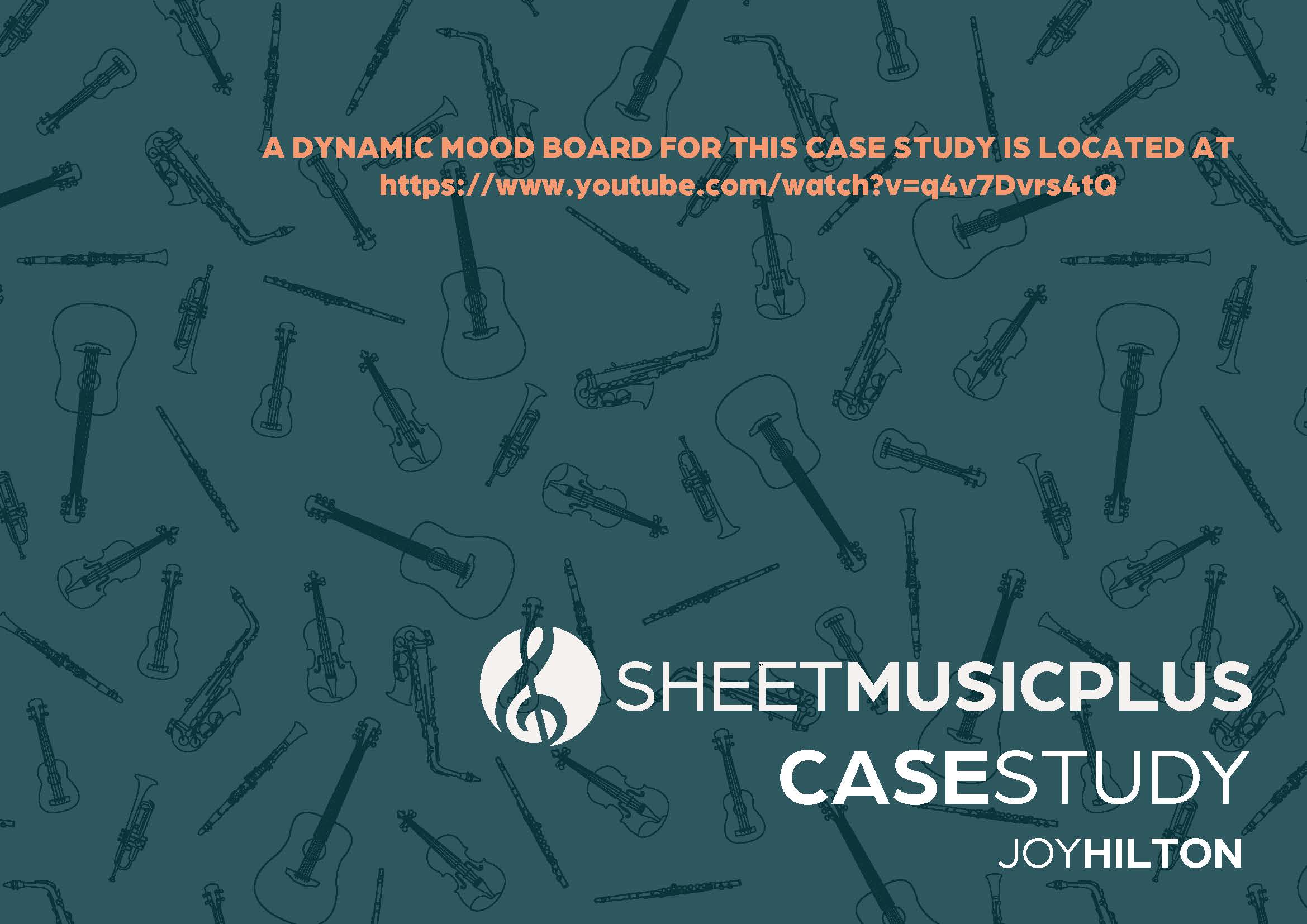
Click below to view the full case study brand book